Now for the ways you can enhance your killer slide presentation, and they are:
- Fonts
- Colour
- Backgrounds
- Images
Fonts Really Do Matter
Yes, that is correct that fonts really do matter as they play a big role in any presentation. So, when choosing a font to use, you need to think about your topic and whom you are presenting this to. Then, make sure that the style of font you choose truly aligns with the type of mood you want your presentation to create.
For example, when speaking about a serious topic like health issues, you would NOT use Comic Sans or Segoe Script, or similar fonts. Instead, you would choose a font that blends nicely with the theme of your entire presentation.
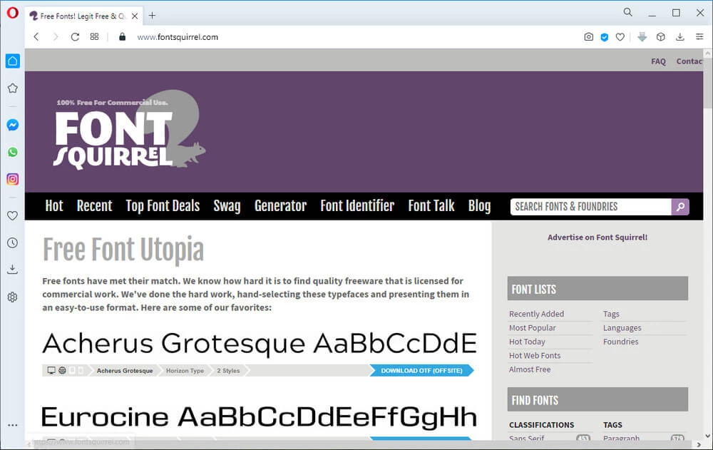
You can find a wide selection of fonts to choose from on websites like: fontsquirrel.com, dafont.com, fonts.google.com, for example.
But, do be careful to NOT get carried away with your use of different fonts. If you find yourself tempted to include several different fonts throughout your presentation, do NOT do that.
When you mix too many fonts into one presentation, you lose uniformity and your presentation will look though it was created by a child.
The best rule to keep when selecting the fonts for your presentation is to use no more than 2 different styles of font in any one presentation.
The different styles of fonts create different moods, so you wouldn’t want a playful font (like Comic Sans) with a more serious font (like Calibri) when your topic is a serious one.
Some professional slide presentation designers even go so far as to suggest that you stick with Sans Serif fonts such as: Arial, Calibri and Century Gothic, simply because they are better suited for short phrases that are recommend used on slides.
The Serif fonts such as: Times New Roman, Batang and Courier are used by articles in magazines because their styles help create a look of the letters being connected.
As for the size of fonts to use on slides, there is no rule to follow. But, once again, professional designers suggest sticking with a font size of 28 point or larger for office sized groups where 32 point or larger for larger groups such as those in an auditorium.
…I offer you an algorithm: find out the age of the oldest person in your audience and divide it by two. That’s your optimal font size. ~ Guy Kawasaki
Source
https://guykawasaki.com/the_102030_rule/
Other Font Tools
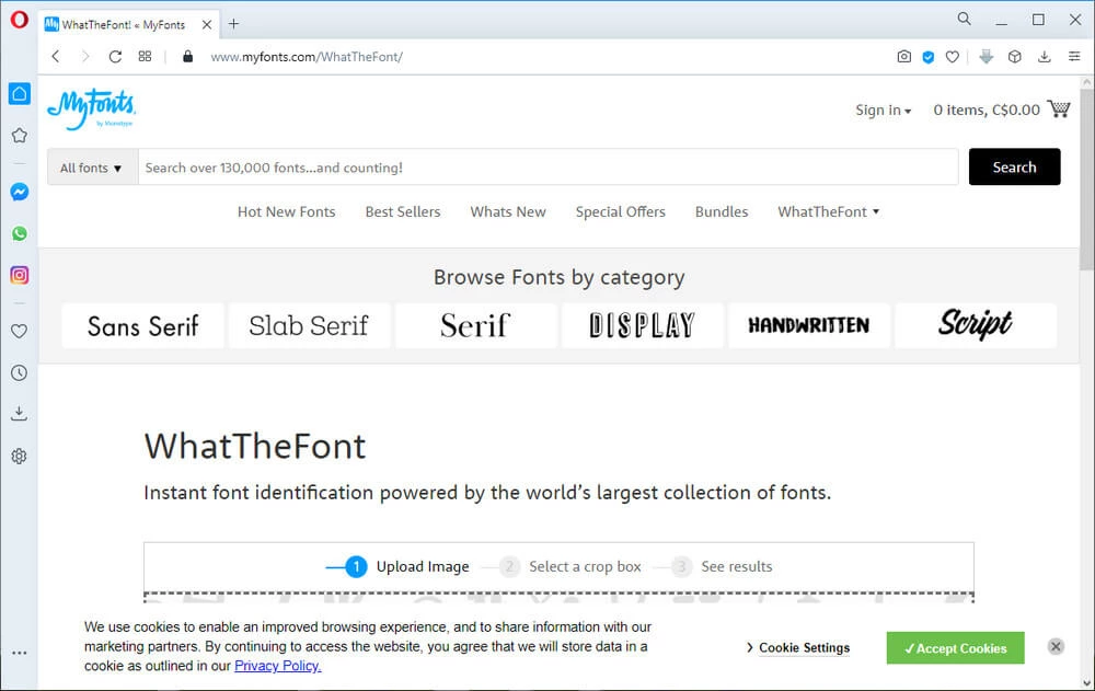
WhatTheFont – will help you identify a font when you drop your PNG or JPG image of the unknown font you want information on, into their designated box on their website… and follow their prompts.
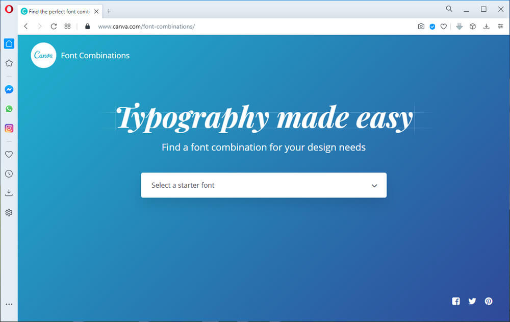
Type Genius – owned by Canva… and they have removed the pain out of pairing fonts by putting together font combos for your designs in hope of helping you to find the best matches.
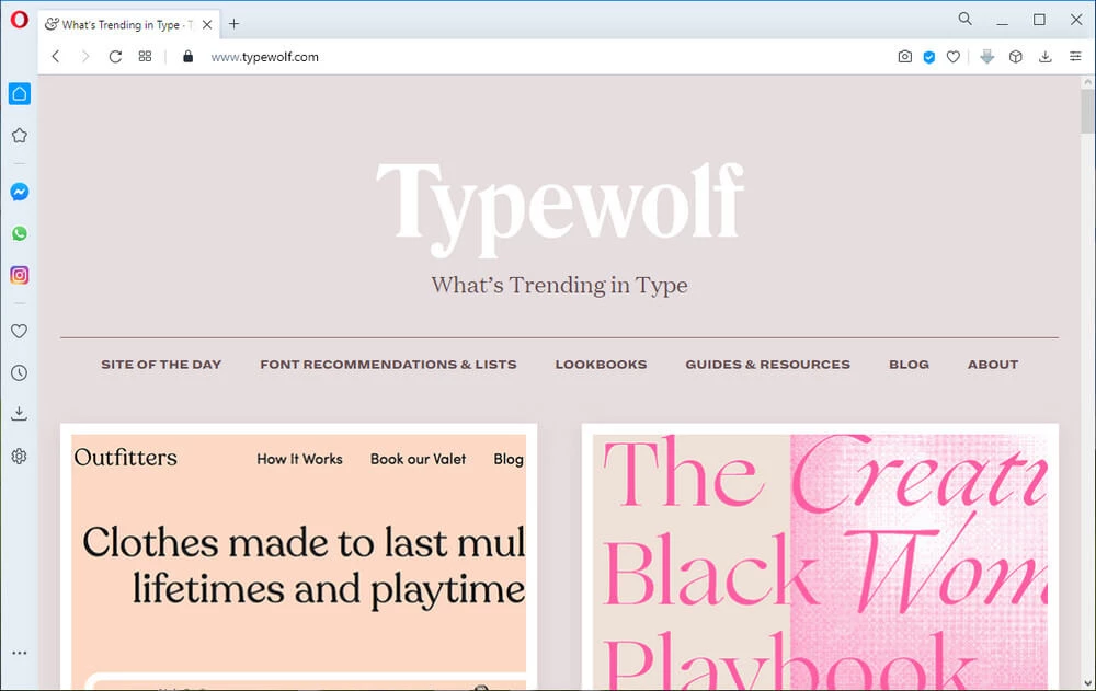
TypeWolf.com – will help you choose the font combination for your presentation and a whole lot more.
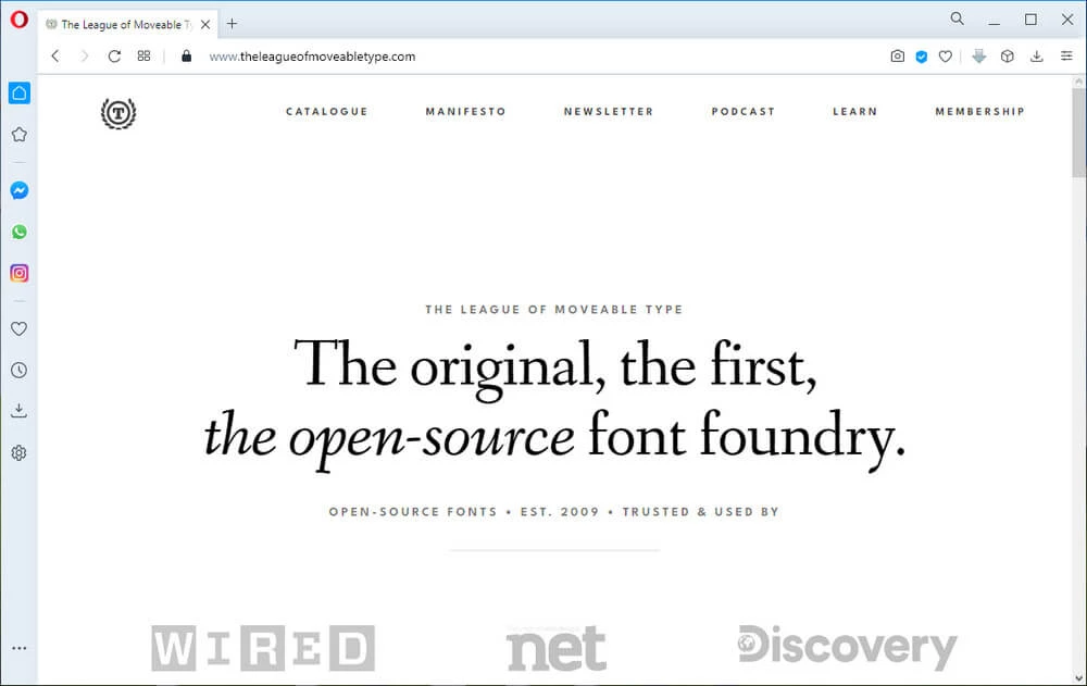
TheLeagueofMoveableType.com – an open-source font shop where you can learn how to use fonts and polish your skills as a designer.
Why Colour is So Important
The use of colour really is critical to the success of your presentation. Colour can invoke feelings and create emotions, while it attracts attention, influences moods, indicate meaning, as well as increase a person’s recall.
Some studies1,2 even show how using colour can increase learning and retention.
Because the human eye can only process about 5 colours at a mere glance, it is best that you limit your colours by using colour conservatively.
You also need to be consistent in your colours throughout your entire presentation. Using too many colours would only serve to make your presentation look though created by an amateur.
Different colours can cause different emotional reactions from your viewers. The following image shows how some colours are perceived by the masses.
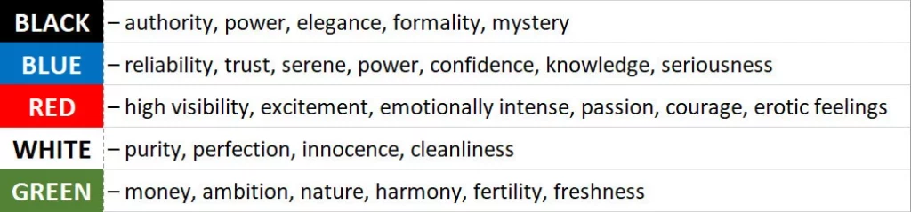
When you understand the perceived emotional reactions to colours, you can use this to your advantage in controlling your viewer’s mood with your presentation. It is important that you make your audience feel the way you want them to feel.
For example: To create a feeling of trust and reliability to your viewers, then be sure you use blues rather than reds or greens.
For a better understanding of the effects that colour has on human psychology, you might want to visit ColorMatters.com for more in-depth information.
Selecting your colour theme is a matter of your personal taste as there really is no golden rule. The common agreements are to NOT pick too many colours unless your presentation is referring to kids toys and/or colourful candy.
Depending on what you are starting with, there are ways to select a great colour scheme for your presentation.
For example: Maybe you have a logo or picture in which to start building your theme with. Then, all you would need to do is to upload that image to an online extraction tool like Adobe.com offers, or you can use their Color Wheel.
How to Use Abobe’s Online Color Wheel
Though George Peirson shows you how to use Adobe’s free online tool for use in Adobe’s other software called Photoshop Elements, this can be used the same way in your slide software of choice.
Once you have the colour theme of your choice, you can start to build your theme by choosing the colours that Adobe generated for you.
There are other free, online color extractors that you can use, such as: TinEye.com, ColorHunter.com, ColorsSchemeDesigner.com,
So, where do you go for inspiration for your presentation, so that your chosen color conveys the:
- Mood you want to set
- Depicts a style you want used
- Conveys a personality you want experienced
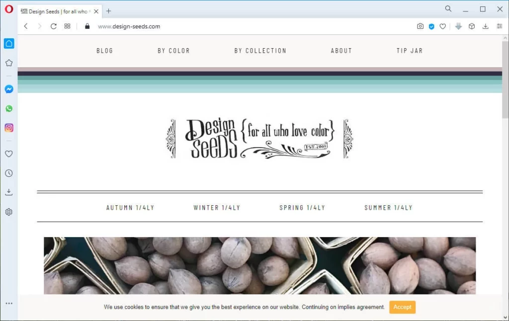
Design-Seeds.com is one site that is highly recommended because of its simplicity, elegance and powerful use of colours.
Apparently, this site sees the inspirational details in an image. Go ahead, check out the site… and don’t be afraid to click some of the options. You won’t break anything clicking and viewing the options.
Always keep a good contrast in your use of colour so that you audience won’t have to strain and guess with what you have typed on your slides.
When actually choosing your colour palette, it is advisable for you to make sure it matches the backgrounds of your slides, as well as other colours you’ve selected.
A final test should be conducted by testing it on the projection you will be using to show your presentation. Some colours will look great on your computer but look diluted when projected.
If you are not using your own projector, then make sure that you arrive early enough to have time to make any final adjustments that may be necessary.
Another great tool to help you with your colours is ColorCop.net. It is a FREE multi-purpose colour picker for Windows users only.

And below is a video depicting an older version of their website, but the demo given by Abbey Duhé of their software is the very same today.
Color Cop Tutorial
This tool will help you match your colours from one element to another to help keep your presentation harmonized in appearance. Using the color picker, you can easily match the colour code from one of your images or text, to another, on which ever slide you need to.
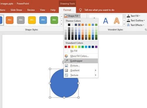
PowerPoint includes something similar. It’s called an Eyedropper.
However, their tool will only pick up the colours used within PowerPoint itself, leaving you unable to grab the colours of ANYTHING else unless you copy and pasted your chosen object onto a slide within PowerPoint. This restriction alone can make the ColorCop software a lot more user-friendly.
Backgrounds Should Be Kept Simple
You do not want your viewers focusing on the background image of your presentation instead of your key message on your slide, so selecting a background colour without any watermarks, shapes or logos is advisable.
It is also advisable to use dark or light colours but refrain from using pastel colours as they can become easily corrupted by some colour printers and projectors.
When using a dark background, you could even go so far as to add a tiny gradient to your chosen color, making one angel of the slide a shade lighter than the other. Better still, check out the video below.
Create Gradient Background in PowerPoint
Choose Your Images Carefully
When choosing a background image, it is vital to think about how your chosen image will work with your other elements that you add to your slide, such as text, fonts, and colours. If your background image is to have objects in it, be sure to select one with lots of space in case you want to add text on top of it.
You should check through several images looking for that perfect image. Do NOT simply settle on the first one that MIGHT work okay enough. Find an image that catches your attention AND fits consistently with the theme of your presentation.
Dreamstime.com and Depositephotos.com are my preferred online stock image websites to find awesome, unique images.
Be sure to PAY for images you want to use, and do NOT simply do a Google image search and use what you find there, as that could leave you open to a potential and costly law suit.
More Advise on Images
Using real people, displaying real emotions and real events always works better than those that have been staged, as they tend to look rather… cheesy.
If you use images from websites that CLAIM to be free for commercial use, DO check for the need of providing proper attribution if necessary and DO follow their rules.
A great method for creating a consistent look to ALL of your images in your presentation is to start by looking for the most important slides that actually convey the “meat” of your message. Think over and then design those slides first.
Then be sure to continue to replicate that look and feel to all of the slides across your entire presentation.
Your presentation title slide is the first slide your viewers will see; therefore, you need to make sure this slide sets the creative tone and mood for the rest of your slides that follow.
This will be your presentations FIRST IMPRESSION and you only have a few seconds to grab your viewer’s attention, so make sure you start your presentation off with a BANG!
So, be sure your title slide makes it known to your audience that they are in for a very special treat.
100 Great Examples of Title Slides
Think of your presentation as a movie.
As you know, a movie is a series of individual frames that when shown rapidly, one after another, creates the illusion that motion is happening. If you were to throw in a random frame, it would mess up the continuity of your movie. The same idea applies to your presentation, but instead of frames you are using slides.
This is why you need to make sure your images look consistent when viewed in a slide sorter. If they do not, then fix it so they do.
Always use high resolution images so that your images won’t come out blurry in your presentation. NEVER simply stretch an image to fit a slide as that is a sure-fire way to create a blurry mess.
Should you find the need to include a screen print, you can find screen capture tools like Skitch, which is a FREE APP that helps you communicate visually. It is a screenshot editing and sharing utility.
How to Use Skitch
There are tutorials on using Skitch on a MAC too.
Remember too that you can remove unwanted backgrounds in your images. So… don’t simply slap that images onto your slide with a background that doesn’t allow your images to be consistent.

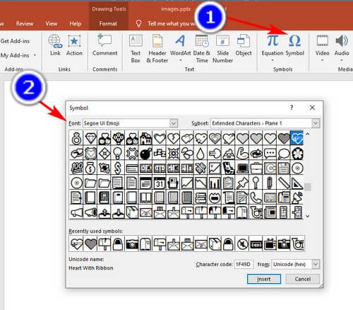
Using Symbols as Icons
When using these, do make sure that those you choose to use are universally recognized to represent what you want it too.
For examples:
📷 = picture
🔒 = secure
💝 = love
You can find symbols to use in PowerPoint. Make sure your cursor is inside a textbox meant for text and then follow the steps shown in the image below.
There are numerous flat icons that are free for commercial use available online, should you find the need for these. Please be sure to READ the small print when using these so that you do not break any copyright laws.
TheNounProject.com is said to be a great resource for icons to use in creating a global visual language that unites all.

Creating Your Own Images
Sometimes you will find the need to simply create your own images.
When that happens, you will be pleasantly surprised to discover how carefully combining shapes and lines that you can create some pretty awesome looking images, templates, and/or layouts for your slides.
Merging Shapes in PowerPoint
More Tools…
PhotoFilters.org – you can edit your photos and apply different filters and effects to your images and more, directly online.

Unsplash.com, Pixabay.com, Pexels.com, and even Dreamstime’s freebies make for great sources for high quality, unusual, and unique images.
My favourite tool for reducing the file sizes of my images BEFORE uploading to the internet… you can also use for your slide show images. Introducing TinyJPG.com and for that one unique image you want to find where to buy it… I use TinEye Reverse Image Search.
That reverse image search tool has saved me HOURS of searching when I found an image that was only ever used ONCE by another website… and it was the PERFECT image for me to use. Voila! I found that Dreamstime.com had it for sale and I bought a copy to use right then and there. 🙂
Should it ever happen that you are looking for a unique texture to use, then TextureKing.com is the place to help you with over 400 images to choose from.
And if they are not enough, you can try ThePartternLibrary.com, a really uniquely laid out website alllll of its own, offering users an amazing assortment of pattern images to choose from.
Not to be forgotten, you can also look through the wide assortment of subtle patterns available at Toptal.com.
Well, there is one more part to this series and that will include adding charts and animation to your slide shows. I do hope this series has at least intrigued you into reading the last of this 5-part series, which will be titled Adding Charts and Animation to Your Killer Presentation, due next month.
Should you have any question with regards to ways to enhance your killer slide presentation, I do hope you will leave them in a comment below. This way, we all learn together.
Once I have responded to your comment, you will receive an email notification. Looking forward to chatting.
SOURCE
Slides Made Easy 2nd Edition (my affiliate link) by Adam Noar
Credit for Header: 1117826 from Pixabay